Our task this week was to use a style as old as the video game industry itself. Pixel art. This was to be done for our final prototype within our Games design and prototyping module.
Now by this point I already decided what I was going to create my platforming prototype about. My stimulus would be my earlier work within this module. I was inspired by the previous idea I had during my first lecture as well as what I created my first piece of concept art around.
However before this I had already tried my hand at pixel art for a previous prototype:


These first attempts at pixel art were nit my greatest work, therefore to avoid making the same mistake again, I decided to learn from my previous work using the knowledge of colour and shape theory as well as what I had learned within the lectures.
Techniques
Pixel Art originated not as an art form, rather a necessity. During the early console generations, its well known fact that the systems they had then weren’t nearly as powerful as we have today. Moreover high definition displays were merely a dream and 3D was out of the question entirely. Instead, due the small processing power and amount of ram these devices had, the aim was to create simple and easy to recognise assets. Due to these limitations, the developers needed to employ special techniques to ensure the art was easy to read and small.
Pixel Art is usually created within powers of 2, such as 64×64, 32×32 or 16×16. The fewer pixels, the less detail you can achieve. On top of that early consoles like the NES could only display a pitiful 256 colours. therefore, special colour palettes were used to compliment the coloured used within the art, alongside to reduce memory usage.
However a lower range of colours means less accurate detailing and shading. Therefore, a technique called dithering was used. The aim was to create better transitions between colours without the essential in-between shades, therefore the pixels would be drawn so they slowly transition into another colour by placing them at equidistant lengths from the opposing colour. Similar to crosshatching when drawing. While this worked sparingly on old CRT monitors used back then, it isn’t so suitable today. As our screens now have a higher fidelity so we can clearly see the in-between pixels. Luckily (?), this can be used to create a “retro” styled look to your art, despite the art never actually looking like that on older hardware.
There were some trappings to avoid however. Line art shouldn’t be used as unless it used as an artistic choice (below) it makes the art look flat. Furthermore caution should be taken when upscaling small pixel art, as Antialiasing can ruin sprites by softening edges.
Finally it is also important to make sure your art has a decent silhouette to it. Making sure the characters were easily recognisable as it could be the difference between a power-up or a death. The shape of the character needs to be clear to the audience.
Main Character
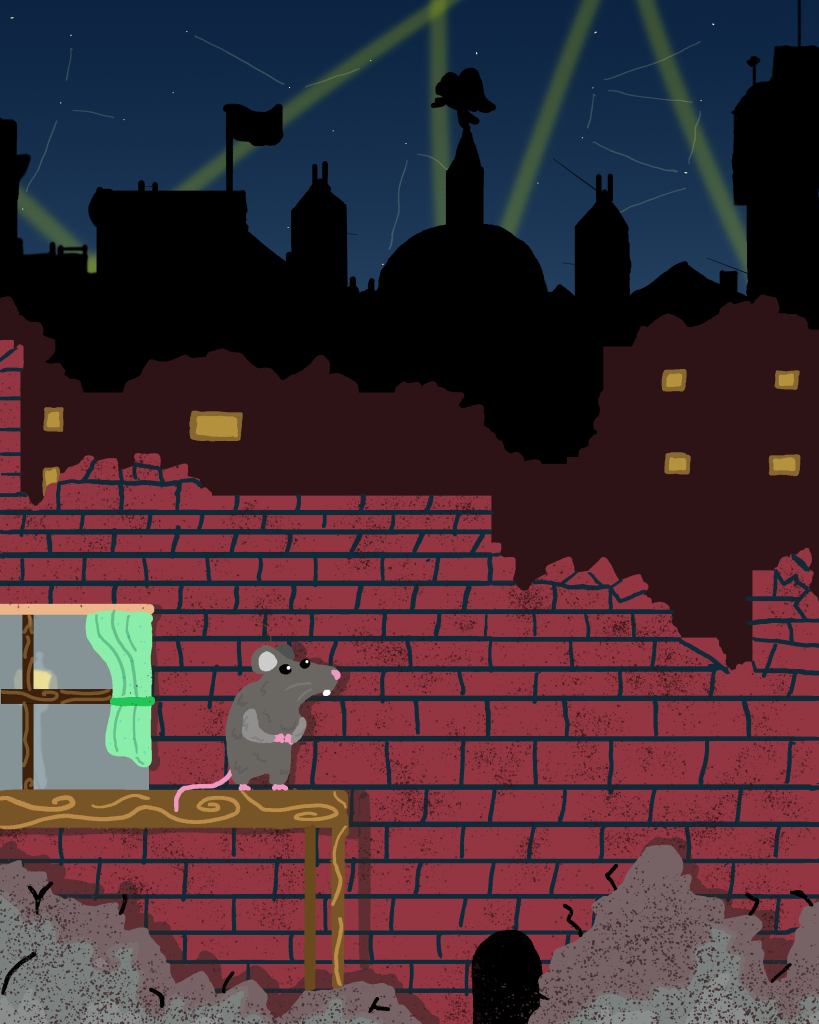
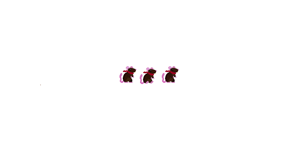
Before I began creating my main playable character I knew I had to alter his design from my initial concept art. This was due to the fact previously I had issues of my sprites blending into the background Therefore I knew I had to change its colour. The finished result looked like this:

I decided to shake up the colours of the sprite and add a few new additions to his design. I used my knowledge of colour theory to change his fur colour from grey to lighter brown, I was worried that once again my sprites would be poorly visible against a dark background. The brown also show the ruggedness and simple-ness of the rodent. This is enforced by the chunk I had removed from his ear. The pink symbolises its innocence and fragility and Finally the red scarf was added to not only alleviate visibility issues, but also to add some charm to the character. it is coloured so to represent the animals courage for fighting against the desolate city in which it roams.
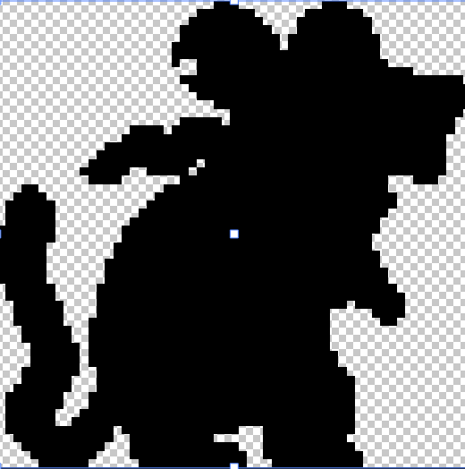
I attempted to employ some of the techniques used by pixel artists as well such as directional lighting from the right, with shadows along his back and under his arms, as well as some highlights in his eyes, ears and nose. (However the latter are very faint). I also tested whether the character had a cohesive silhouette:
Following this I began to add some frames of animation
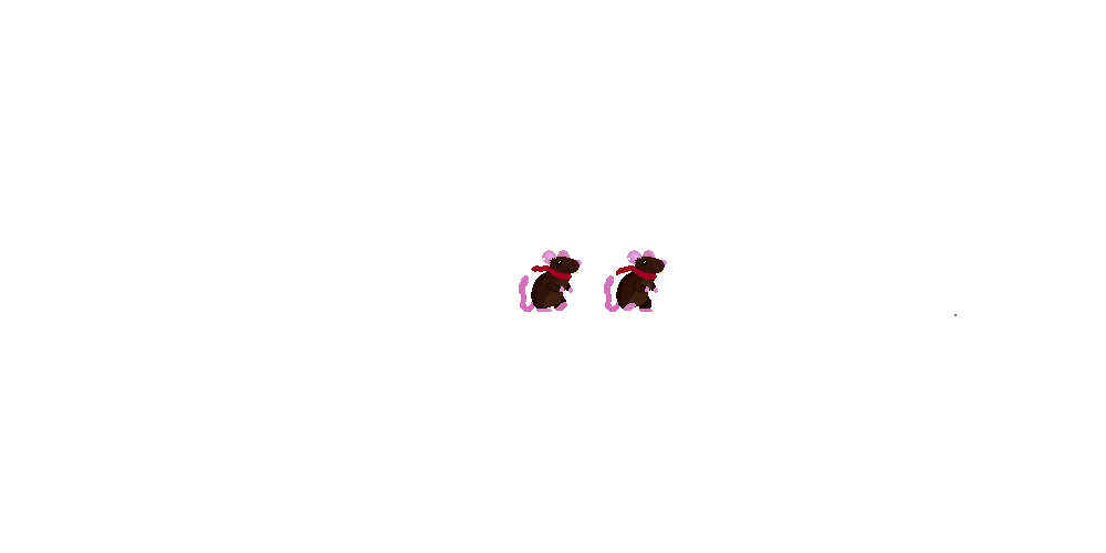
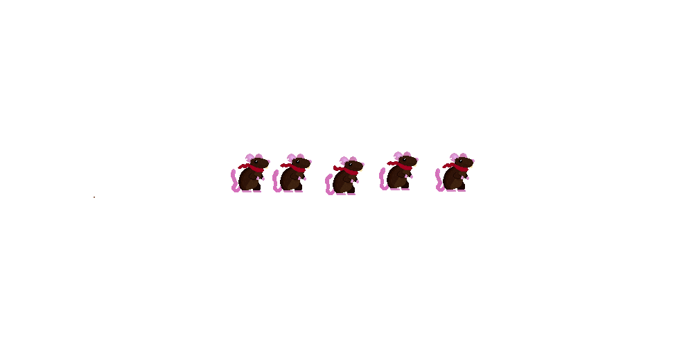
These were to be used dependant on the player actions, I also flipped these for the case in which the player was facing or going left.
Each animation conveys the little pitter-patter of a rodent I was after and the idle wags the tail and allows the scarf to blow in the wind.
Of course I don’t like how little frames there are to each animation, especially the walking I believe that could use some in-betweens , therefore in future I will change this to include multiple frames of animation.
Onto of that I will make sure to create both a left facing and right facing sprite set as the shading and details such as the bite in its ear are flipped which doesn’t make much sense from a lighting and consistency standpoint.
Hazards
I created two types of hazard for the player to avoid, these were themed around the playable character:

I created this enemy to be jumped upon, therefore I needed it to look somewhat friendly whilst still showing its aggression. By creating a rounded cat paw. the player may be invited to interact with it. of they jump on it a bounce is rewarded. however I hinted at its aggressive side with its sharp, triangular claws. This implies the underlying evil that the player would find out if they was to collide with it.

This Hazard I tried to look much less inviting, despite the block of cheese. You will notice the shape of the trap itself is made up of triangles, implying its danger, even the cheese is triangular and a bright yellow. subtly warning the player to not touch it, otherwise they die.
Platforms and Decorations
I created a multitude of assets to decorate my scene with, however due time constraints I was not able to create all I wanted to.


Evaluation
I believe this attempt at pixel art, Far exceeds my previous attempt. By putting the techniques I had learned about into practice, this allowed me exceed the mistakes such as line art and improper shading i used in my original series of images.
In the end however, two things I definitely need to improve on is my animation and tile work. Unfortunately I don’t think either of these aspects were up to scratch with my usual standard.
References
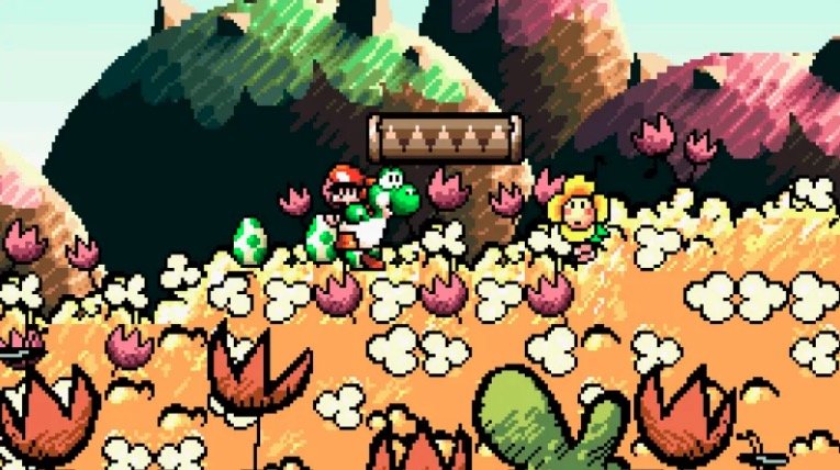
(1) Nintendo (1995) Yoshi’s Island