In week 5 we covered the essentials of shape and colour theory and how that is essential when creating you own unique character designs. The colours used and the shapes which make up your character can subconsciously effect how the player views said character. This is because our brains naturally associates attributes to these aspects of design.
Our task was to take what we had learned from this, and implement it whilst we created sprites for another prototype of ours (a top down shooter).
Colour
Colour can be used to manipulate the emotion a person feels towards an object, character, brand, etc. This is done frequently in all kinds of media such as in shows, adverts, book covers, and of course games. When you see an advert trying to sell you toothpaste, they use whites and blues as these colours represent cleanliness, perfection as well as strength and dependence. those colours work for the product they are trying to sell, However if they were to use browns and greens you would automatically be less inclined to buy the product as your brain associates such colours with grime and disease. Not all colours have just bad connotations however, many colours can invoke opposite emotions. Red for example can invoke excitement yet also be scary with its ties to blood, it all depends on the context of which it is used.
The Hue refers to a colour’s wavelength. Warmer colours such as Red’s, Orange’s and Yellows invokes feelings of excitement and high energy; Colder colours however invoke calm feelings and low energy. This can also be considered when designing your character.
Consider using complimentary palettes when designing characters as well. This boils down to colours that look pleasant together (A good tool I used is adobe colour wheel (1)). Characters with contrasting palettes, especially those with high saturation (the intensity of the colour), may be unappealing and will not look nice on the eyes. A good colour palette is essential for good design.
Shape
Much like how colour can give positive and negative annotations to the brain, the use of shape within a design can do that also. There are 4 main aspects about shape to consider.
Circular shapes are good at invoking friendly emotions into a character, they are not threatening and look organic to us. This can be used to create a warmth about a character as circles look harmless and inviting
Squares are strong and reliable. They can be used to create a dependable looking character as they always look balanced and sturdy like a building. On the other hand they can be used to create an intimidating character due to those same properties. However rounding the sharp edges of these designs can be used to reduce feeling, making them look friendlier due to incorporating some circular design.
Triangles are not organic as well as sharp and aggressive. Much like the head of an arrow, triangles show direction. By exaggerating the points of a triangle this can be used to induce emotions such as fear.
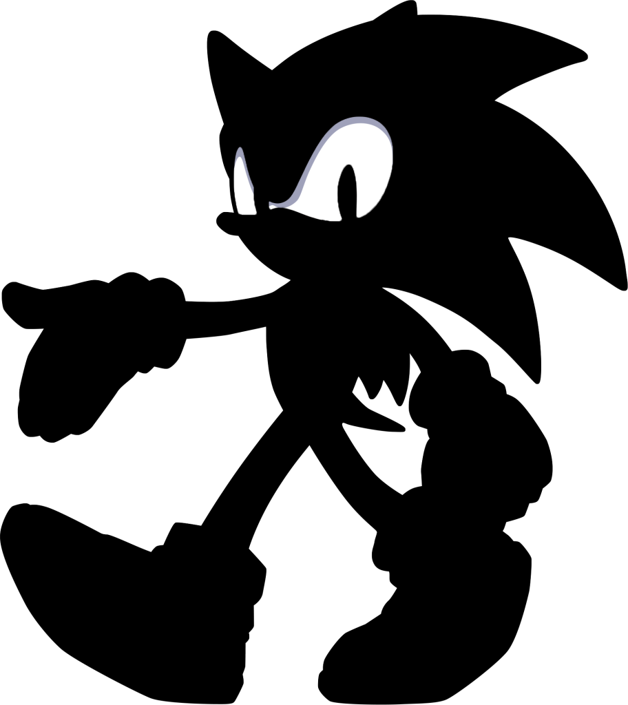
Finally, Silhouettes are key when designing a recognisable character design. Silhouettes essentially means the outline or shape of the character. A good silhouette will highlight the primary features of a character or the main shapes that compose of it. A good silhouette indicates a good focus in character. A good example of a good silhouette is Sonic the Hedgehog: The key features of his design are immediately viewable, such as his large shoes which indicate he is a runner as well as his long spines that show the “90’s edge” on the character, triangles were used to make him seem less friendly and more “cool”.
Implementation
Now I understood the basics of colour and shape theory, I could begin work on my sprites for my top down shooter. However I needed an inspiration for my assets. The night before my lab session however, I was asked to play a Call of Duty® Black Ops 3 (2) Zombies mode. We played on the map Origins, which is set during WW1 rather the common WW2 setting. Following this I took my interest in the world wars once again to influence my designs. Whilst initially thought to be quite cliché, I enjoyed translating their uniforms and weaponry into a top down style.
Once again I set up a new Photoshop project, this time with the dimensions of 256×256 pixels whilst also enabling artboards. This allowed me to created duplicates of my canvas so I could work alongside my previous designs for scaling reasons as well as export them together.
Since I was unfamiliar with creating top down assets i found some images online I used for referencing:
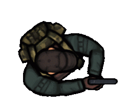
Once I had created a suitable naming convention for each asset (those being, player, enemy and bullet) I began to work on my player controlled character.
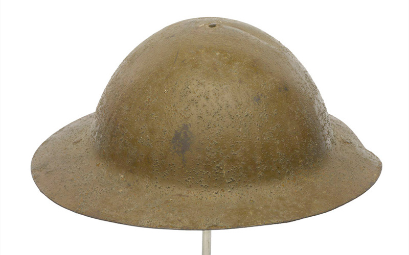
Whilst creating my character I needed to make sure my character looked both reliable, and friendly to the user. I decided to use a British mark 1 brodie helmet, such as this one:
I decided to colour it green to symbolise peace, good and security rather than its average brown colour seen during the war (which was a means of camouflage). The same circular imagery was used when I decided to use the Lewis gun as a gun for the player to hold due to its iconic circular magazine. I also included rounded off squares for the soldiers pouches, invocative of his strong yet dependable nature.
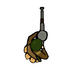
I also included a personal feature, that being the KOYLI (Kings own Yorkshire Light Infantry) badge on the soldiers right arm as this was battalion in which my ancestors fought.
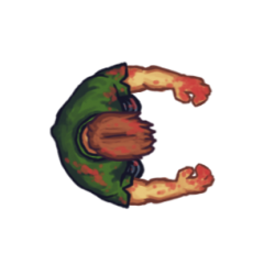
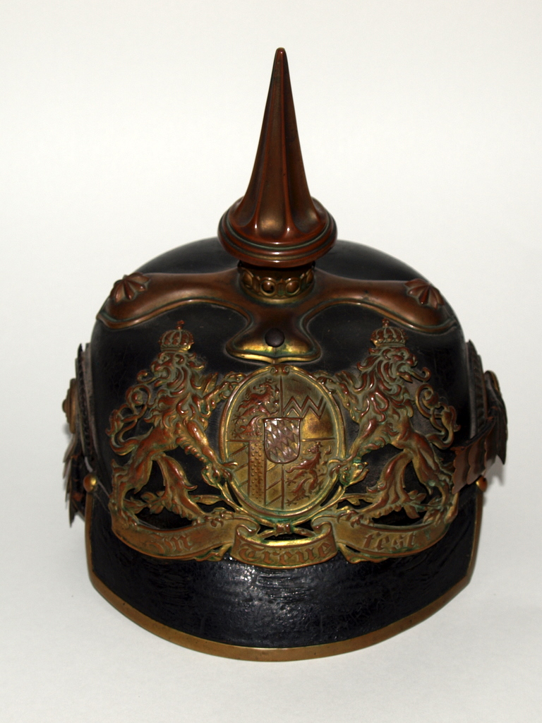
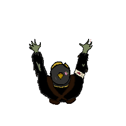
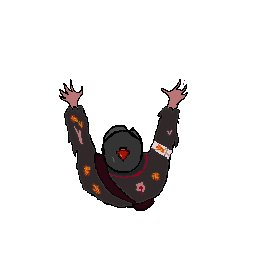
As for the enemy design, I of course based off the German officer uniforms that appeared along the western front. This design was to include many more triangles as opposed to the previous, to show the enemies hostility. In contrast to the Brodie helmet used for the British, I instead chose the iconic Pickelhaube helmet due to its recognisable golden spike atop the helmet. this of course fit the exact shape language I was looking for in such an enemy.
I added other spiked elements from the ripped uniform to the jagged claw-like fingers. I also coloured their uniforms darker blacks and greys as they are synonymous with death and added red blood and green skin to emphasise the themes of horror and plague.
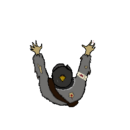
I also created two additional styles for enemy variety:
This enemy is a darker black to draw attention to the player as well as emphasising the theme of death as this is a faster, deadlier enemy.
For the fire enemy in particular, I changed the hue of the regular enemy to create the warmer palette which is evocative of fire.
Finally I created bullet sprite so the player could shoot the zombies:
I didn’t do anything too fancy here, simply created a rounded point to show its lethality yet it is friendly to you the player. I also attempted some distortion effects but these could be improved.
Evaluation
In the end, I think I displayed a good use of colour and shape theory within my sprites whilst also keeping them accurate to my initial stimulus. If I was to improve on anything though it would be my use of shape, without the restrictions of a historical setting, I could use much more interesting shapes within my designs. Overall there improvements to be made with each design. However I feel proud of these assets as a lot of care and attention was put into their designs due to it being a personal interest of mine despite some considering the stimulus to be well covered.
If I have learned anything from this task however its:
A: Know your limits
I had multiple assets as well as a trench themed “map” that I had created on artboards as wellto be used within my final project however either got cut due to time or unfortunately lost.

B: Consider gameplay as well as design
Due to my theme, ironically enough the characters blended into the background due to their camouflage, this was fixed in the final released however by making a much darker background.
References
(1) CyclonX64 (2014) https://www.deviantart.com/cyclonx64/art/Sonic-Silhouette-471413874
(2) Activision (2015) https://www.callofduty.com/uk/en/blackops3
(3) Gombart, R (2015) https://opengameart.org/content/animated-top-down-survivor-player
(4) Gombart, R (2015) https://opengameart.org/content/animated-top-down-zombie
(5) Rix, H (2015) https://ww1.nam.ac.uk/1904/news/brodie-helmet/#.Y5q8lHbP0uU