To expand our knowledge and technical proficiency with 2D art, we needed to know how give our 2D images a sense of depth. This was important as it gives us a baseline on how to create realistic and improved concept art, especially for 3D Games.
Our task this week was to experiment with the composition techniques shown to us and create a perspective piece drawing.
Composition
When trying to give an object a sense of depth on a 2D plane, a technique called perspective, needs to be utilised. One point perspective is the first, and most simple variation of this. Simply put, there is one area of focus called the vanishing points, all objects drawn should begin to shrink the closer they get towards the vanishing point. when drawing at a one point perspective, draw the image as u would see it if from a 2d perspective, then begin to add the depth either above or below the shape. This is dependant upon if the shape in question is above or below the horizon line ( The x axis of the vanishing point).
Similarly there is 2 point perspective, where there are two vanishing points on the image. rather than drawing from the face of the shape, instead you begin to draw from the edge. There is also 3, 4, 5 and 6 point perspectives, each with a greater amount of vanishing points, allowing the user to see more sides to the object. Most of these are unimportant to my task however.
Finally its important to utilise the rule of thirds. As the name suggests this divides the image into thirds using two horizontal and vertical lines. Your art should be drawn to fit these thirds. Furthermore the focal point (the area you want the viewer to be drawn towards) should be placed along the intersect of these lines. This is useful as that is where I will place the vanishing point within my art.
Creation
Once again we are into Photoshop using the graphics tablet. Setting up a 1920×1080 72 ppi canvas to work on, i then imported a Thirds grid premade for us. I placed the grid on its own layer against where I will be drawing.
I then created a line along using the line tool the x axis of one of the intersects, thereby creating the horizon line. Using a polygon tool, I then created a star like shape to show all the tangents my work should be running along. I did this by setting the number of sides to 100 and setting the star ratio to 1%. I then added this polygon and enlarged it so it encompassed my entire canvas. The centre of this polygon would be my vanishing points so I placed it upon the horizon line in line with the thirds intersection (bottom left intersection).
It ended up looking like so:
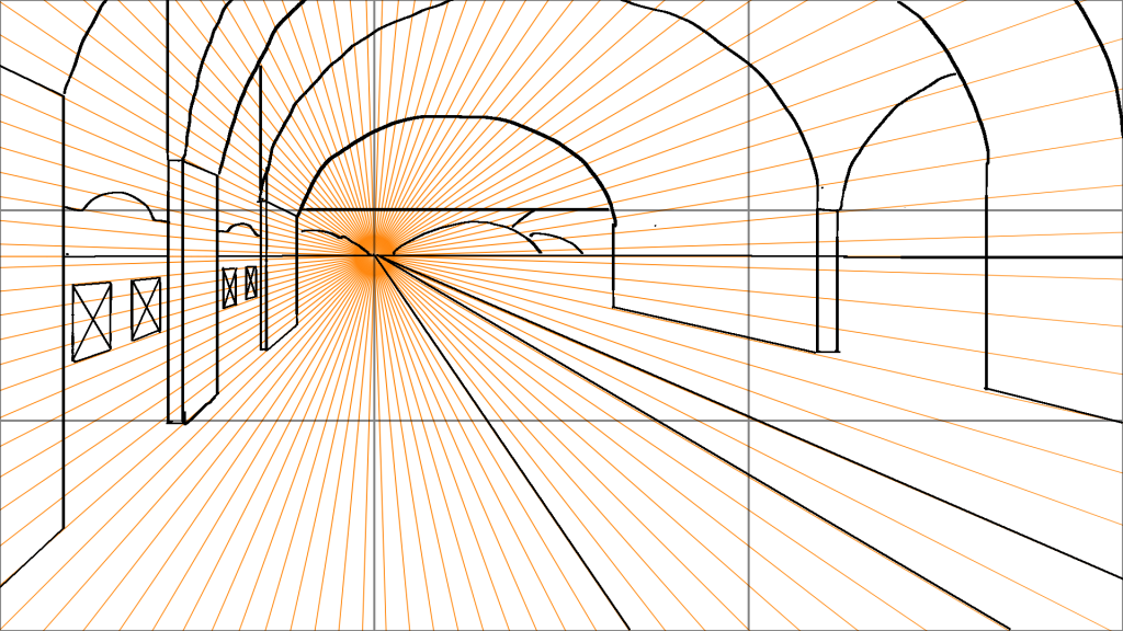
I tried by taking inspiration from a train station platform. not dissimilar to the ones you would find in York and the like. However whilst I made an attempt at creating different walls and challenged myself by adding curves and depth to what is supposed to be the bed in what the train track sits. I did end up struggling to create each wall, especially with all the guides and lines as it I couldn’t focus properly. However i made sure that all lines would be heading towards the vanishing point. including the hills in the back.
Evaluation
Whilst I have some experience drawing at one and two point perspectives I not only found that it makes quite a difference to the quality of your piece, but also how it is not an easy thing to accomplish. Whilst difficult to first wrap you head around. those key golden rules of thirds and vanishing points really allowed me to feel as though I could make a significant step up within my artwork. I am glad I only attempted a one point perspective piece. In the end I wish to expand on this further as this does not satisfy what I believe I can dousing these techniques, despite it taking significantly longer than I initially expected.
I believe the key basic elements are there so that someone could recognise what this is meant to be. however to improve on this I would try to add some colour and greater detail alongside some realistic shading because as it stands it looks very basic.