For our third task, we would be stepping away from photoshop into its sister program, Adobe Illustrator. This was because we would be creating the UI associated with the prototype of a “Cookie Clicker” styled game we was to make in the Games Design and Prototyping course.
(The result of which can be seen here: https://baines-2022.hulldesign.co.uk/2022/11/24/prototype-1-ducky-clickr/)
My goal for this task was to create a series of applicable buttons that could be used later down the line in unity for my prototype. By this point I had decided that my game was be themed around a duck pond, and as such should have a rustic calming feel to them, as well as being sort of playful like how it felt to feed the ducks as a child. my aim was to replicate this design philosophy into my UI.
Creation
Opening Illustrator I created a new project by setting my canvas size to 1920×1080 pixels, which would be the resolution my game would be played in. I also made sure the PPI (Pixels per Inch) was set to 72 alongside a transparent background, much like photoshop.
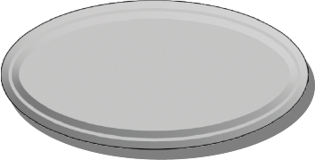
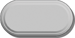
I started by creating a series of 3 different shapes.
An Ellipse:
An Oval:
And a Hexagon:
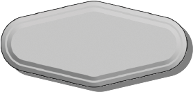
For each button I added two bevels to give the buttons a sense of depth. This was done by selecting the “Effect” option in the top bar and navigate to the “Extrude & Bevel” option. Upon opening the new window I adjusted the values of the depth before repositioning the view to front facing and then altering the bevel height and width values.
Prior to this I created a drop shadow for each button by duplicating each, changing the hue to full black and decreasing the transparency to around 60%. I then layered the shadow beneath the button and grouped them as one asset.
I intentionally left these grey and unmarked so they could be used in many ways within my project, saving me the effort of creating a unique button for each button in the game. instead I could add the text and change the colour of the button within the unity editor.
Additionally I created a large rectangle that fit the whole screen and another rectangle inside it. I rounded the edges to each of them yet especially the upper rightmost corner. Following this I diffused the difference between the larger and smaller rectangle, deleting the smaller one, yet leaving a hole in the larger one with the same dimensions.
Following this I then filled the shape with a prebuilt pattern and a flat brown colour. when layered on top of each other I believe it looked similar to foliage around a pond. This was done to fit the games theme
This was the Result:
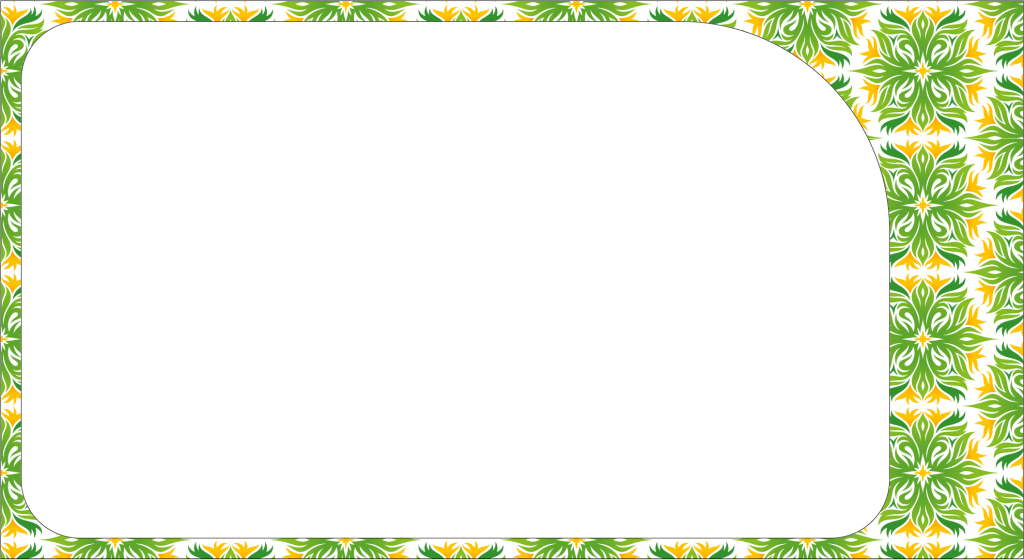
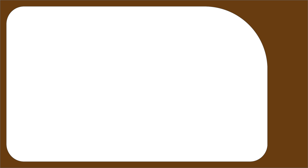
These together would create the border for my game.
Finally I looked to create the primary button for the player to click whilst playing the game. I decided that the best course of action was to create my own unique button of a duck.
Opening photoshop once again. I used what I had learned previously from week one.
(Which can be seen here: https://baines-2022.hulldesign.co.uk/2022/12/15/week-1-intro-to-adobe-photoshop/)
I began to sketch out a duck using a reference I found on the internet (1) as inspiration for how its lighting and proportions should look. This was an attempt to improve on the mistakes I made whilst creating my environment.
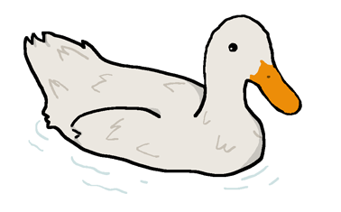
I gave the duck a Thick black outline to make it visually distinct to the player that it was supposed to be clicked. I also tried my hand at some improved shading. Furthermore I added a small ripple effect around the duck, so it would look as though it is floating in the water on the blue background of my prototype.
All of these assets were exported as PNG files so they had a transparent background. rather than a white one which would look odd within a games UI.
Implementation
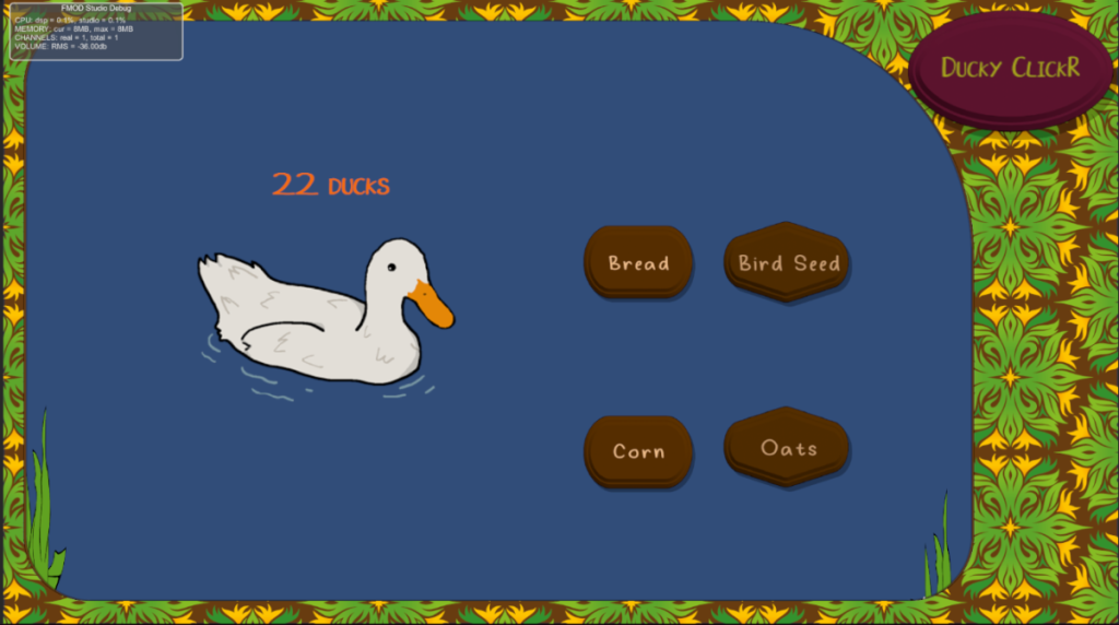
Once I had imported all the assets into my unity prototype, I made sure to alter the designs of the buttons. One to house the title of the game (purely decoration) Whilst the two other buttons were used to differentiate the two differing types of power ups (addition based and generation based) making visually distinct to the player what each does. I scaled the duck to be much larger than the other buttons and placed the counter above it to indicate to the player what it is used for. Finally I coloured the buttons brown to fit the rustic feel I was aiming for. I also added a font, aptly named “Ducky” (2) to the buttons, fitting the playful theme of the game.
Evaluation
I believe the UI elements I created perfectly capture the vibe and theming I was aiming for for the prototype. Despite this however a part of me does consider if I created unique assets much like the duck for the upgrades. I do enjoy the fact the the type of upgrade is visually noted by the shape of the button, perhaps I could of made a menu with the buttons I created for each type and given the upgrades an actual image as well. Nevertheless I believe my UI elements worked well with what I was aiming for. In future however I have learned that creating your own buttons aside from the tools given within the illustrator editor would prove for a more dynamic looking product, as well as making sure they are reusable, as this saved me lots of time in the end.
Refrences
(1) Baldwin, M (2008) https://www.flickr.com/photos/hooley/2599266595
(2) Seeduck (2021) https://www.dafont.com/duck-2.font