Our task set for week to was to expand upon the knowledge we learned of photoshop during week 1. For this task we was to source our own series of images from creative commons sites (such as Unsplash) and create an environment by editing those images into a single scene. This technique was called Photo Bashing. This technique is great for drafting up composition for concept art as it speeds up the workflow by already giving some inspiration to the artist. Furthermore, if done correctly, it can produce a realistic looking image.
Concept
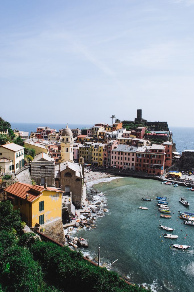
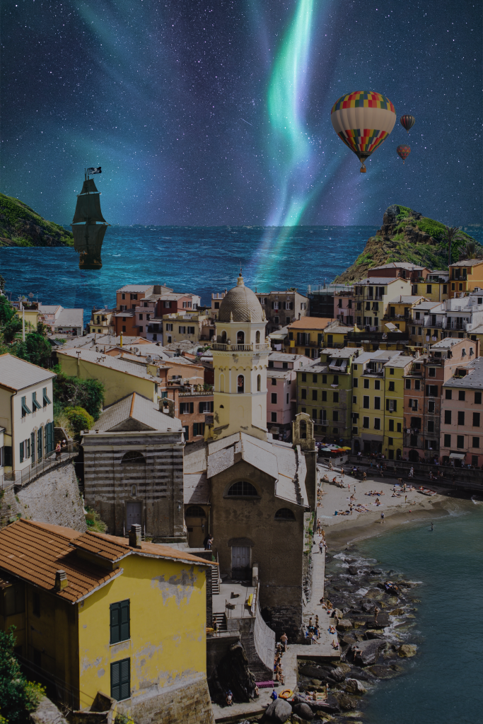
When thinking what to produce for my photo bashed image, I settled on an idea of a whimsical and vibrant port town. I started by Gathering some images from Unsplash and Pexels.
Once I had gathered these primary elements (alongside a few others) I then imported them into a new photoshop project.
Creation
Much as I had done previously i created separate layers to house each individual image. I placed my sky on the background layer and using the Magic wand tool, deleted the background on my port town image.
Similarly I used the “Layer via cut” option within select subject tool for my fantasy elements, so they had no background and was ready to be added to the scene.
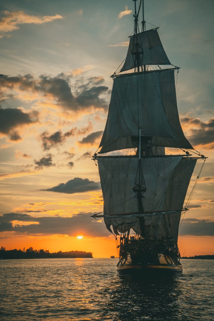
Once each of my layers were correctly positioned. I then changed the hue and saturation of each layer to match that of the sky. this meant darkening each layer while also adding a slight blue hue. In the case of the tall ship however I instead increased the brightness of the image, as the source was quite dark and the details would be indistinguishable to the viewer if darkened any further.
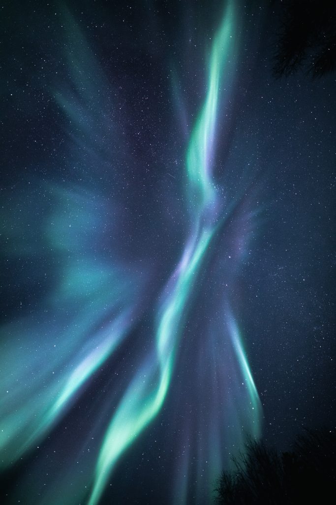
With the layer that includes the ocean. I reduced the layer’s transparency effect so the northern lights could be seen reflected on the waters surface.
Following this is decided I wanted to have a shadow of the ship cast onto the waves much like the reflection of the light. therefore I copied the layer and decreased the brightness and transparency so that it appeared to be a shadow of the ship. I then transformed the image by rotating it 180 degrees so it would sit beneath the ships hull. Alongside this I also slightly stretched the image on the Y axis so the shadow would look distorted like in real life.
Before I was satisfied however I noted the colour of the bay water was different to that of the ocean behind it, therefore I experimented by used the colour picker tool, and began to paint over the bay in with a less opaque pencil so the colour of the bay would better match that of the sea.
Evaluation
Whilst I am certainly happy with this attempt, I cannot help but think what more I could of done. rather than testing my skills I had learned in the previous sessions, I feel as though I had only utilised them again yet alongside other techniques to produce more authentic images.
In terms of what i experimented with during this task. I like the outcome of painting the bay a matching blue. However, I received peer feedback that the lights of aurora borealis shouldn’t look as they do in my image when they meet the horizon line. In future I will attempt to add some kind of distortion or mirroring effect so the reflections look truer to life.
Furthermore. I regret how the shadow of the tall ship is cast. I made a fatal error in this aspect as I inaccurately displayed how the shadow should look. rather than being stretched outward toward the town it should be shrunk and wrap around the bow of the ship. i would also try and create a more realistic shadow in future.
Overall though. my experiments with hue and brightness came out a success in comparison to my previous attempts I believe.
References
(1) Boehler, B (2020) https://unsplash.com/photos/jqdpdtPrKwc
(2) Vojtovicova, M (2021) https://unsplash.com/photos/7cfAzY0mj9w
(3) Claire, R (2019) https://www.pexels.com/photo/coastal-town-with-colorful-houses-4846529/
(4) Klavins, R (2021) https://unsplash.com/photos/mW51ftJqW6U