Part 1: Photoshop Basics
Upon starting this course I regarded myself as a novice with Adobe’s Photoshop software. I had used the program before for previous projects and within my studies however upon looking on the myriad of tools at ones disposal, I still found myself quite intimated by the sight of it.
Despite this my introductory class to this module would push me to conquer this feeling and acquaint myself with the features and tools within the editor. Lucky for me however, this began simply with a tour through the essential tools of the program and how to appropriately format my future works, This included but is not limited to: Setting the resolution scale of the piece, typically 72 DPI (Dots per inch) as its the standard for most screens, Adjusting the aspect ratio of the canvas and changing the background between white and transparent.
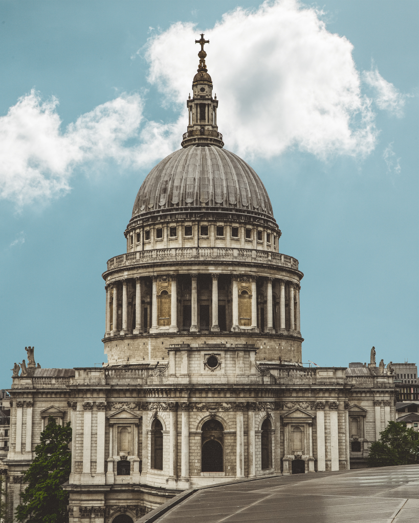
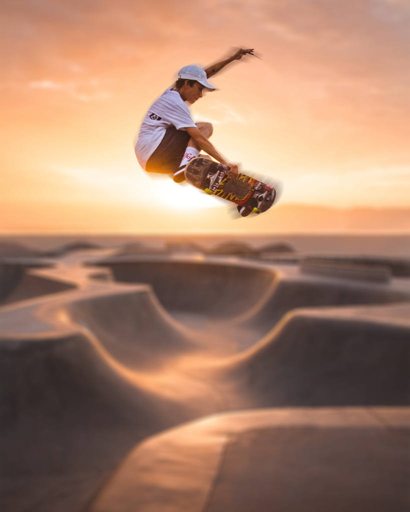
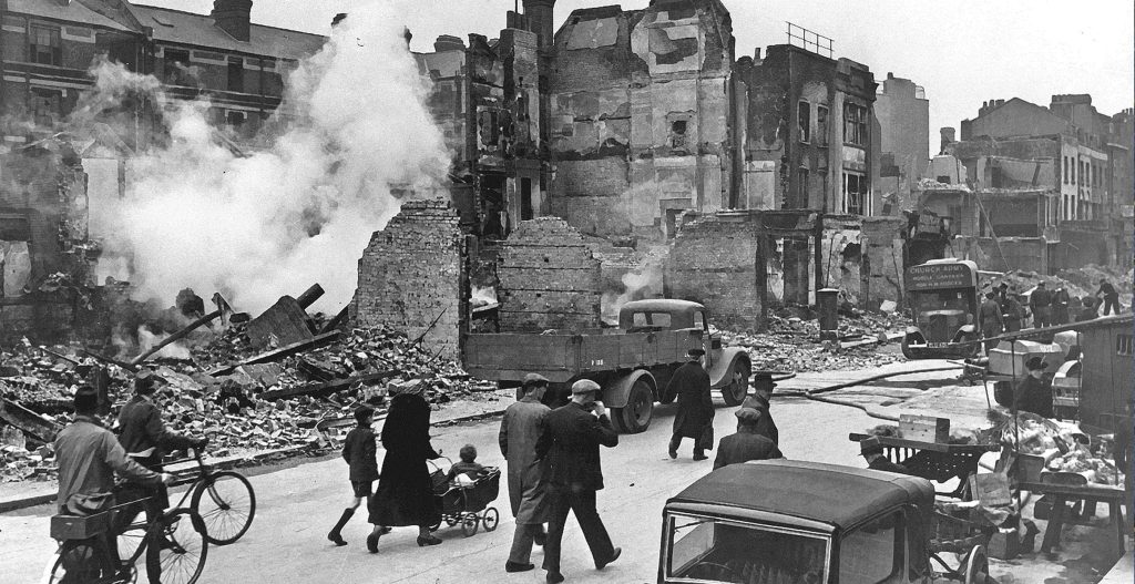
I first task to prove our competence was a simple “Cutting and Pasting” Job. In this task we used the Magic wand tool to highlight the background of an image of Saint Pauls Cathedral.
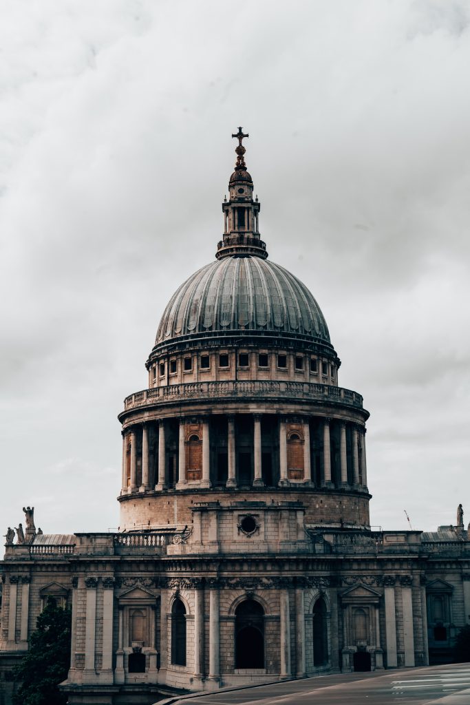
By Selecting the background to this image, a dashed line would appear around said selected aspect. Click on the line would remove the selection and clicking within the line would increase the selected area.
I continuously clicked on the line as it grew to a larger size, encompassing most of the background surrounding the cathedral. However I would continue to find gaps within the selection due to clouds, or areas the image couldn’t identify as part of the sky, therefore I turned adjusted the tolerance slider for the magic want tool, present at the top of the window which alleviated some of my problems. Following this I then deleted the selection (Backspace) and cleaned up some of the smaller details via the eraser tool. I made sure to decrease the pixel size of the eraser as well as make sure I didn’t erase more of the image than necessary.
After the background was fully removed I had made a grave mistake however. As I had done all of this on the background layer. Therefore I created two new layers and labelled them “Foreground” and “Background” and placed them in a hierarchy which would lead the Foreground layer to be the top layer and vice-versa. I then deleted the original image on the original background layer, not before copy and pasting it onto the top layer.
Following this, I imported the sky image into the background layer and toggled the hue and saturation of the design within the Image settings. This was done as I believe the bright sky didn’t mesh will with the originally dimly lit image.
Our secondary additional task was to edit an image to give a sense of motion. This once again utilised the use of the magic wand tool.
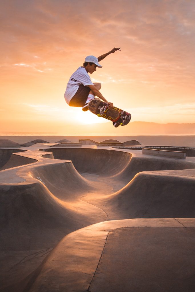
Firstly, I selected the focus of the image (using the same aforementioned skills to enhance the selection), that being skater, and created a new layer to house a copy of only him. Following this reselected the following layer and accessed the filter menu to create a blurring effect. I selected a “Field Blur”. I then experimented with the settings within the blur’s menu until I found a suitable style. I did this as well with a “Spin Blur” in which a created a circle around the focal point of the image to blur to give the skater a sense of inertia.
Part 2: Environment design
Following our introductory tasks to the software, we was given the reigns to go create something of own, so long as it was a concept for an original character or environment. In addition to this, we was also given a tool in which to work on, that being a graphics tablet. Whilst I had never used a graphics tablet before, I was familiar with drawing my own concept art for potential games I could create within my free time, so needless to say I was glad to draw with “Pen and Paper” rather than rely on the inbuilt shape tools and the mouse.
Inspiration
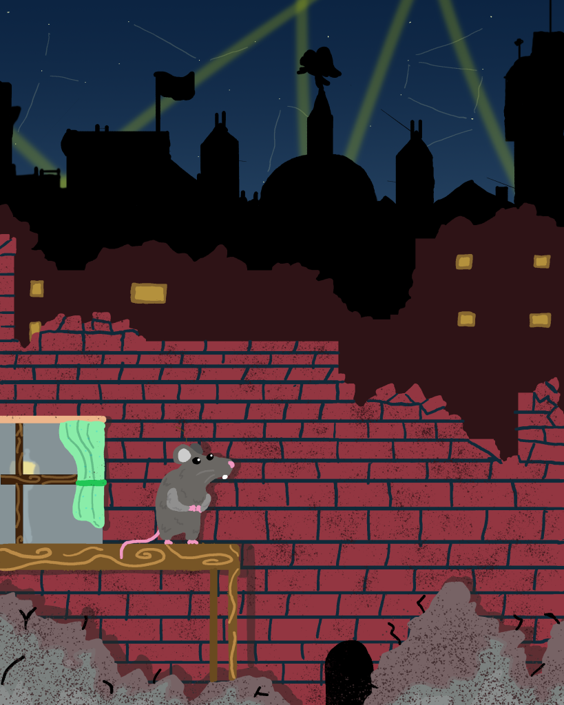
During our first lecture for this module, I had had an idea for a 2D Side scrolling platformer in which you would play as a mouse exploring the rubble of a destroyed city, squeezing through small holes to reach the goal. I was inspired by my own personal interest of British wartime history, particularly that of the Second World War and in this case, London during the Blitzkrieg bombings by German Luftwaffe between 1940-1941. I wanted this game to be played a smaller perspective as to not only increase the emotional impact of the damage (by making it seem so much greater and unconquerable) but also to serve as a unique platforming challenge, such as running across tables and avoiding drains as obstacles. This was inspired by games such as It takes Two as they play from a smaller perspective from that of a humans.
Sketching
Utilising the knowledge I had learned from the original tasks. I decided to use layers to give a sense of depth to my destroyed city. I would shade these with different colours to show the buildings begin to darken as they grew in distance. I blocked said buildings using the Rectangle tool, and then began to draw rubble in the matching colour to add to the silhouette.
For the night sky, I added a dark blue into purple gradient that would add a sense of depth to the sky, I also adorned this with stars and spotlights to make the view more dynamic. I decrease the transparency of the brush when I drew these elements to give a somewhat glowing effect to the lights.
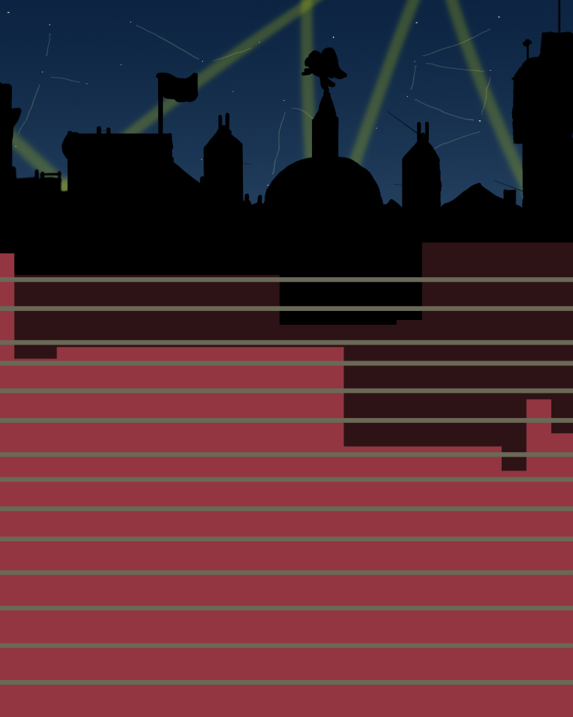
I then discovered that holding shift whilst drawing allows the user to input directly straight lines. I used this technique when detailing the brickwork on the nearest wall.
Following this I then used a different brush with the pencil tool and began to add texture to the objects within the scene. I also used to colour picker to select the same colours for different parts of the environment.
Finally I added some elements such as the rat, mousehole and table to give the scene some key points of focus as well as show the viewer the perspective of the piece.
Furthermore I added some greater detail such as fur on the rat, more rubble in the foreground and added shadows onto the brick all layer for everything in front of the wall to give a greater sense of depth. this was done by choosing a designated light source then drawing in the shading at 50% transparency to give an authentic look and feel.
Evaluation
Generally, I’m quite proud of the art that was made at the time, especially for my first use of a graphics tablet. I believe my work captures my theme quite well and I had incorporated what I had learned within the workshop sessions into my art. However, if I am to improve I need to work on my perspective and use of colour. Due to the minimal shading everything in my scene looks a bit flat, and without proper perspective, the illusion of depth I tried to create with the different layers may be lost as it can be viewed that each layer is atop one and other. However for a first attempt I believe the the themes and ideas I was trying to convey were made clearly within my artwork. I would also try and use more complex tools within photoshop to refine my work. However I did learn the basics of how to compose an environment.
References
(1) Occhi, M (2022) https://unsplash.com/photos/3K1TZ_RmLZc
(2) Morbey, T (2020) https://unsplash.com/photos/r1SwcagHVG0
(3) Adobe (2022) https://helpx.adobe.com/photoshop/using/tool-techniques/magic-wand-tool.html
(4) Unkown https://historyofliverpool.com/liverpool-blitz-photo-gallery/